|
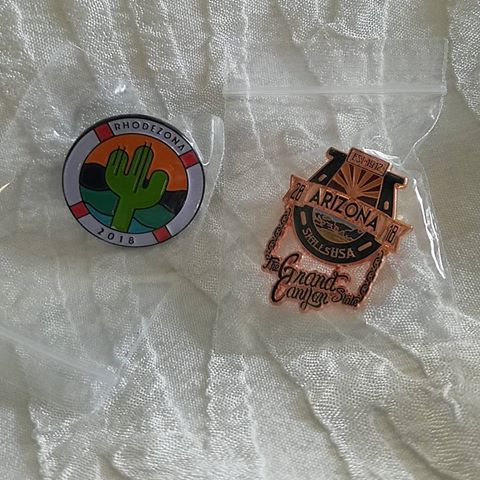
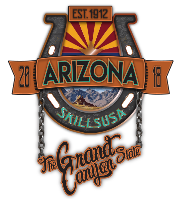
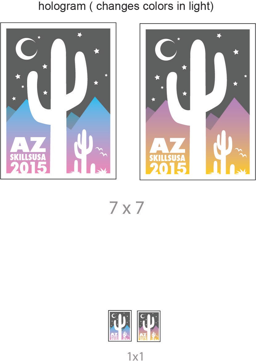
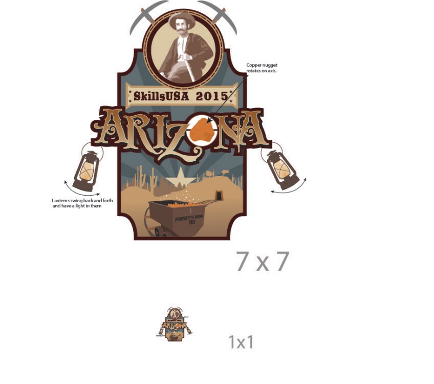
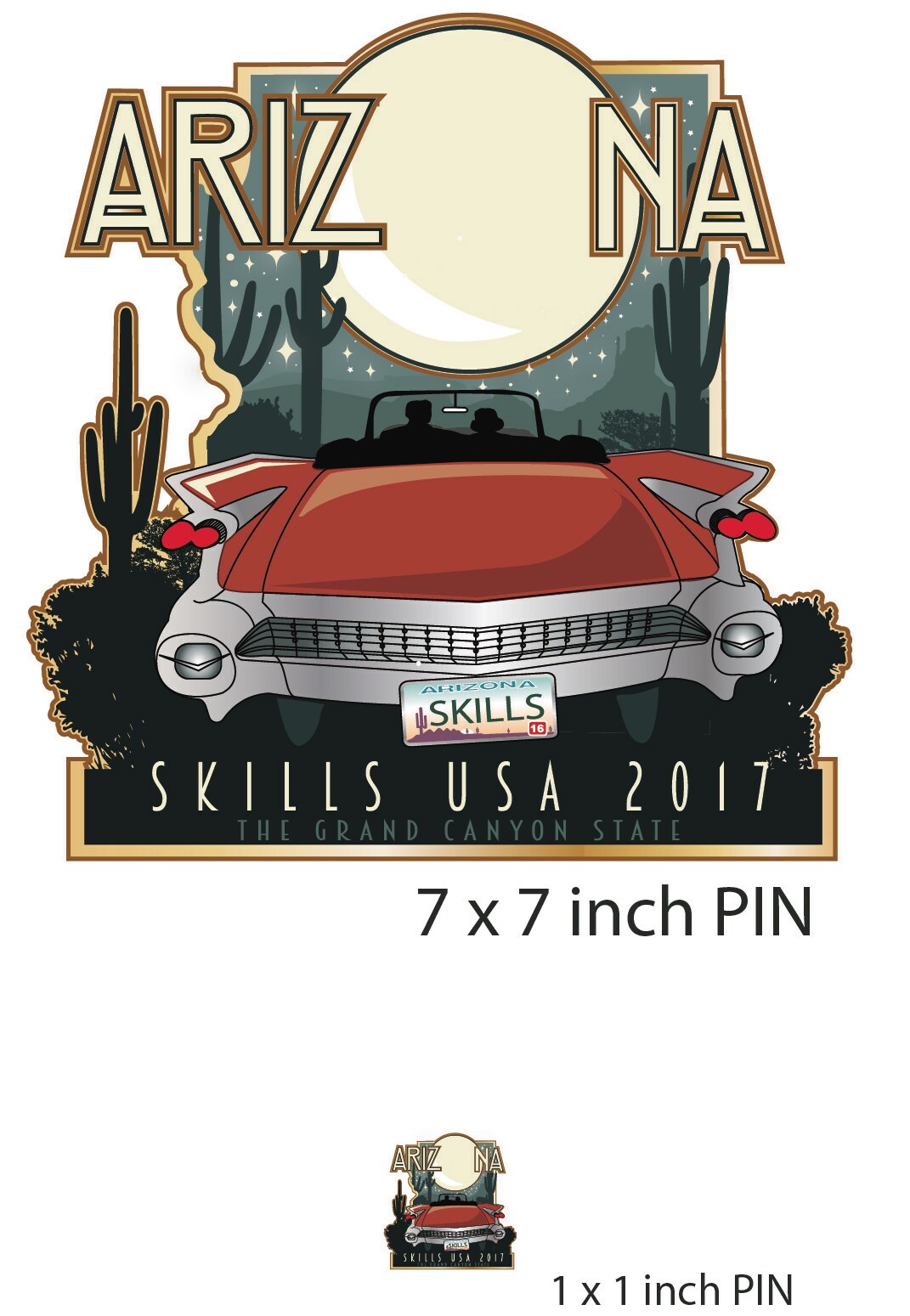
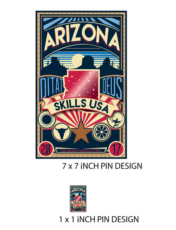
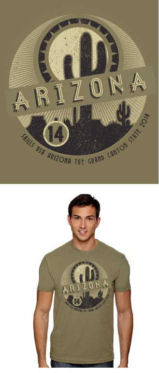
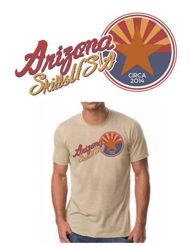
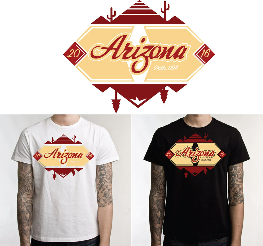
Howdy! I poached some Arizona Pin Designs that were stunning on the interwebs. Really, most of them come from Tucson High School because they really are the only ones I found that post their previous designs online. They're pretty strong. I just wanted you to know what we're competing against. Pin DesignTShirt Design
0 Comments
Objective: THOROUGHLY read the attached competition requirements below. Each step will be graded on the rubric, also included in the document. This mimics the competition exactly. For every step you do not complete or complete unsatisfactorily, your ultimate score will be affected. Often times the competitions are determined within a small margin of points. Make sure you double check the rubric a couple of times during your practice competition. Feel free to utilize photos you find online for any imagery you'd like to include. You may use other rack cards for inspiration, but you must follow copyright laws and may not overtly copy a design. This will disqualify you from the competition.
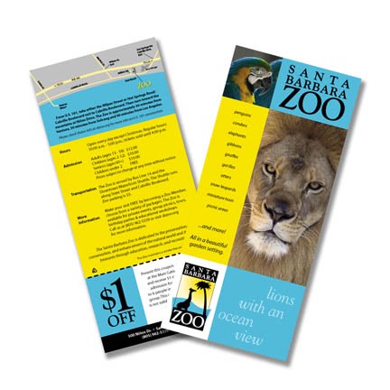
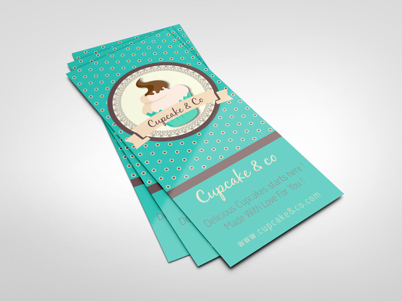
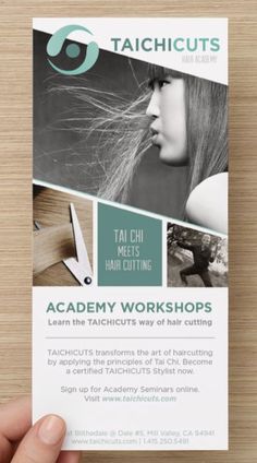
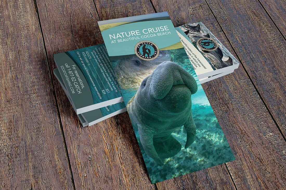
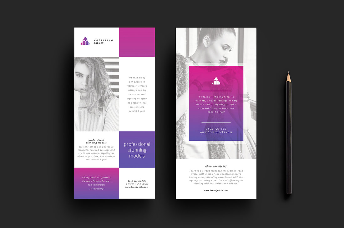
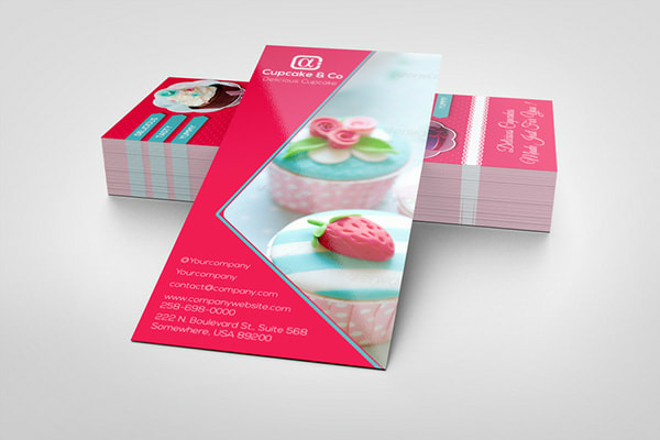
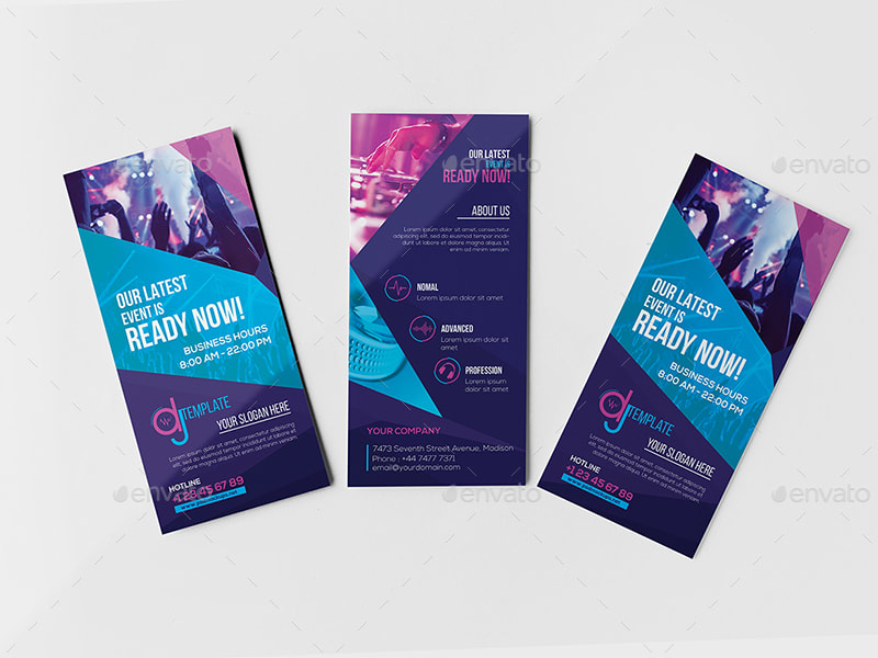
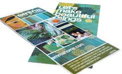
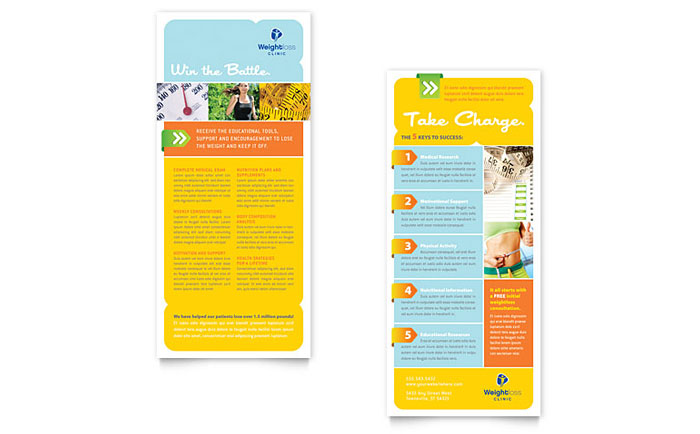
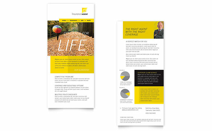
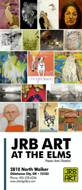
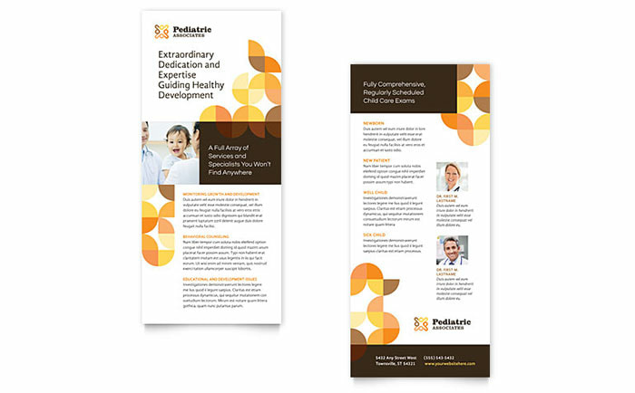
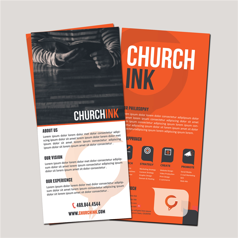
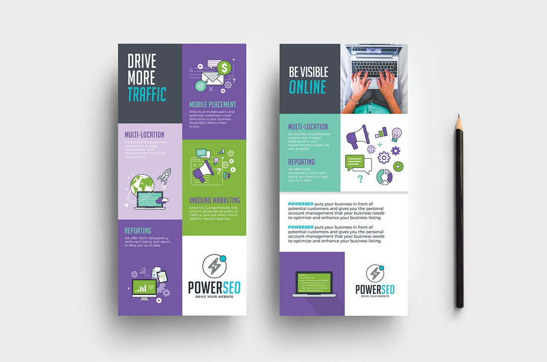
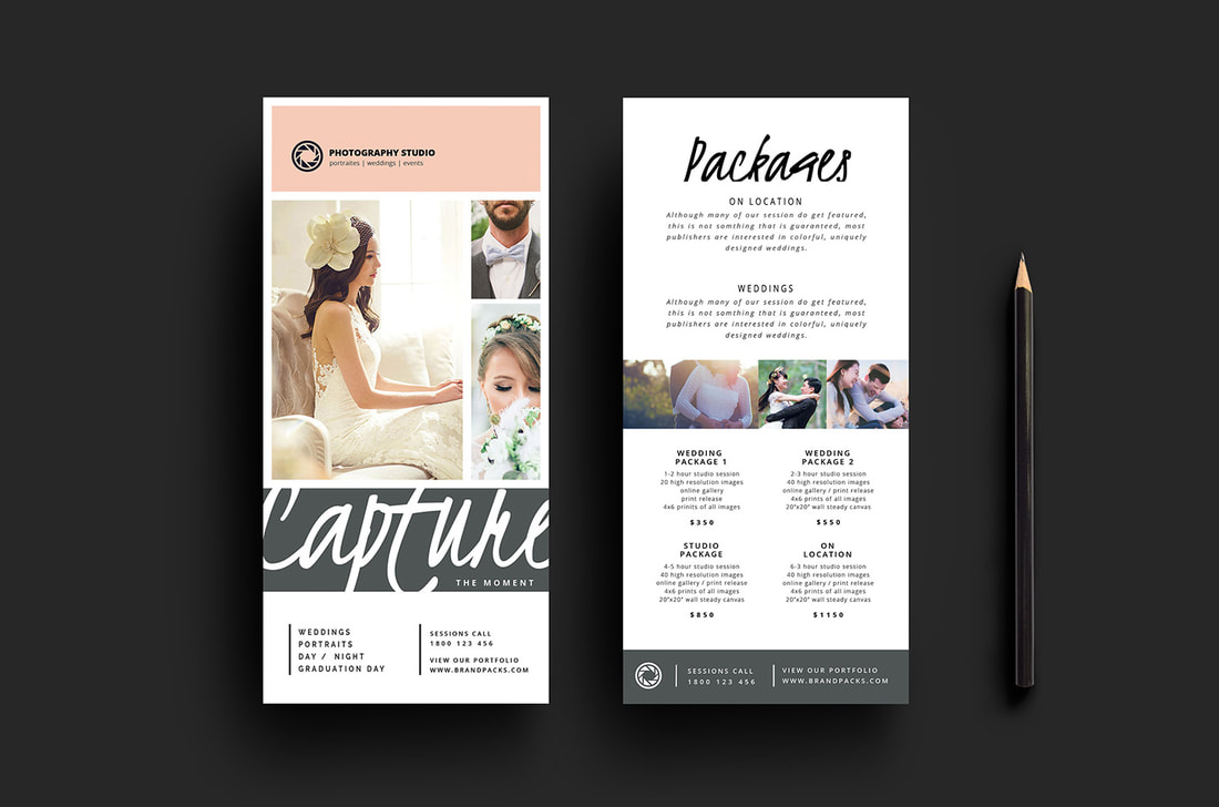
PLEASE READ IN IT'S ENTIRETY! Take notes. Memorize. Utilize these concepts to critique your designs through every step of your workflow. For regionals every year, a rack card is the competition project. Below is an overview of rack cards, some suggestions for your design as well as examples of successful rack cards. Rack cards overview: - Rack cards are front and back - The front of the rack card needs to have an eye catching design. If you think about it, this is the graphic that catches the attention of the customer. It doesn't need too much copy. Perhaps an event location, date and any information that is important in priority. - The back of the card is where the crux of the information is located. People generally turn the card around once they have picked it up for find out further details. - Dimensions: 4x9 inches. With bleed, it is 4.25x9.25 inches. - Make sure you follow the creative process for every step in this design. MAKE SURE you do research and on successful rack cards, create thumbnails, a rough and create a design that follows along with your rough. Common Issues I see: - Make sure you have large enough margins. Sometimes because rack cards have a small dimension, I notice students neglect margins. - Hierarchy! Hierarchy! Hierarchy! What are the most important elements, what is secondary and what is third. - Consider how the audiences eye will flow through the design. How does your hierarchy establish this? - Color, size, texture, space and value determines hierarchy. Utilize this to create differentiation of ideas. - Use proximity to separate elements that are unrelated and link elements that are related. For instance, date, location, time would be closely together on the design. While title of the event would likely be separate and more visually prominent. - Don't be afraid to create unique shapes and use masks or clipping masks. Notice in the examples below that there are two types of layouts. Standard grids and more abstract. Depending on your theme and target audience, you will want to choose a layout that fits the mood of the business. For more radical events, choose something more abstract. For traditional events, choose something more grid-like. |
skillsusaArchives
October 2019
Categories |
||


 RSS Feed
